Excercise 2.0: Sources, Beginnings of Annotated Bibliography
Blau, Eve. “Transparency and the Irreconcilable Contradictions of Modernity,” Praxis 9 This article defines transparency through its visual and physical phenomena’s by the juxtaposition of spaces or the literal qualities of the materials. This article is written for architectural scholars to better understand the different types of transparencies and when to utilize them. This source is useful to the thesis because it helps define elements that will spark the curiosity in the occupant to explore the space.
Eliasson, Olafur. “Your Engagement has Consequences.” In Experiment Marathon: Serpentine Gallery. Edited by Emma Ridgway. Reykjavik: Reykjavik Art Museum, 2009: 18-21.
This article asserts that our experiences on what we perceive are always in motion and dependent on the individual and their memory. By utilizing experiments with context and engagement they’ve shown how each situation is always in motion and different for each person. This article is useful to the thesis because its phenomenological concepts evoke a way of thinking about the “unfolding journey” as not only a physical path but also a psychological trail of interaction.
Holl, Steven, Juhani Pallasmaa, and Alberto Perez Gomez. Questions of Perception: Phenomenology of Architecture. San Francisco, CA: William Stout, 2006.
This source is a book composed of three essays that are thematically linked by the idea that all the senses are needed to completely experience architecture. They assert that human perception and phenomenology play the largest role in architecture. The authors provide evidence to this claim by referencing case studies and outlining the buildings to provide examples of how materials and methods are used. The essays are written for an audience of researchers, students and architectural scholars. This source is pertinent to the thesis because it outlines the methods necessary to engage all of the occupant’s senses, thus helping to create elements that will entice the user to embark on the “unfolding journey” this thesis seeks to create.
Frampton, Kenneth. Introduction to Studies in Tectonic Culture: The Poetics of Construction in nineteenth and Twentieth Century Architecture (Cambridge and London: MIT Press), 1-27.
This source is a chapter excerpt from a book focusing on tectonic meanings, origin and uses. The author presents a walk through the history of tectonics in different cultures, focusing on completed works and their building techniques in order to define a methodology in their use for the occupant. This book is written for an audience of researchers, students and architectural scholars. This source is useful to the thesis because it defines how tectonics has developed throughout cultures and how it can be used to engage the occupant in their surroundings.
Marder, Michael. Phenomenology of Distraction, or Attention in the Fissuring of Time and Space, Research in Phenomenology 41 (2011) 396–419
This article asserts that distractions are an emersion in situations where our perceptions are constantly changing. The author sources psychology scholars to define distraction and attention as different parts of the same concept. This article is written for students, researchers and architectural scholars. This source is pertinent to the thesis because it explains the phenomenology of distraction and helps it to better define ways to eliminate or reduce the causes.
Pallasmaa, Juhani. Six Themes for The Next Millennium. in Architectural Review. (July, 1994), 74-79.
This article critiques the direction western architecture design has moved in its principles and execution. Pallasmaa outlines his own six themes for how architecture can become more attractive in our new millennium, which he based off of the six manuscripts by Italo Calvino. This source is relevant to the thesis because of its theoretical implications that silence is more than just a lack of noise but of turning your consciousness to yourself.
Model to Watercolor Interpretation
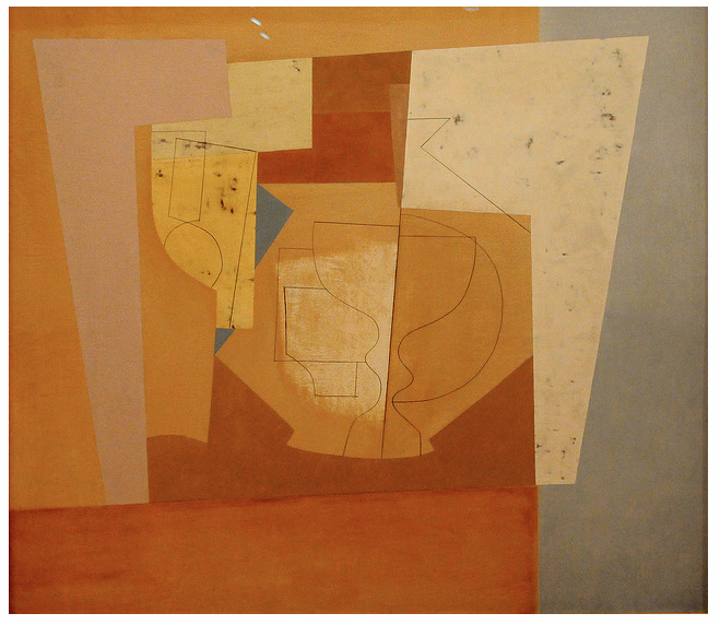
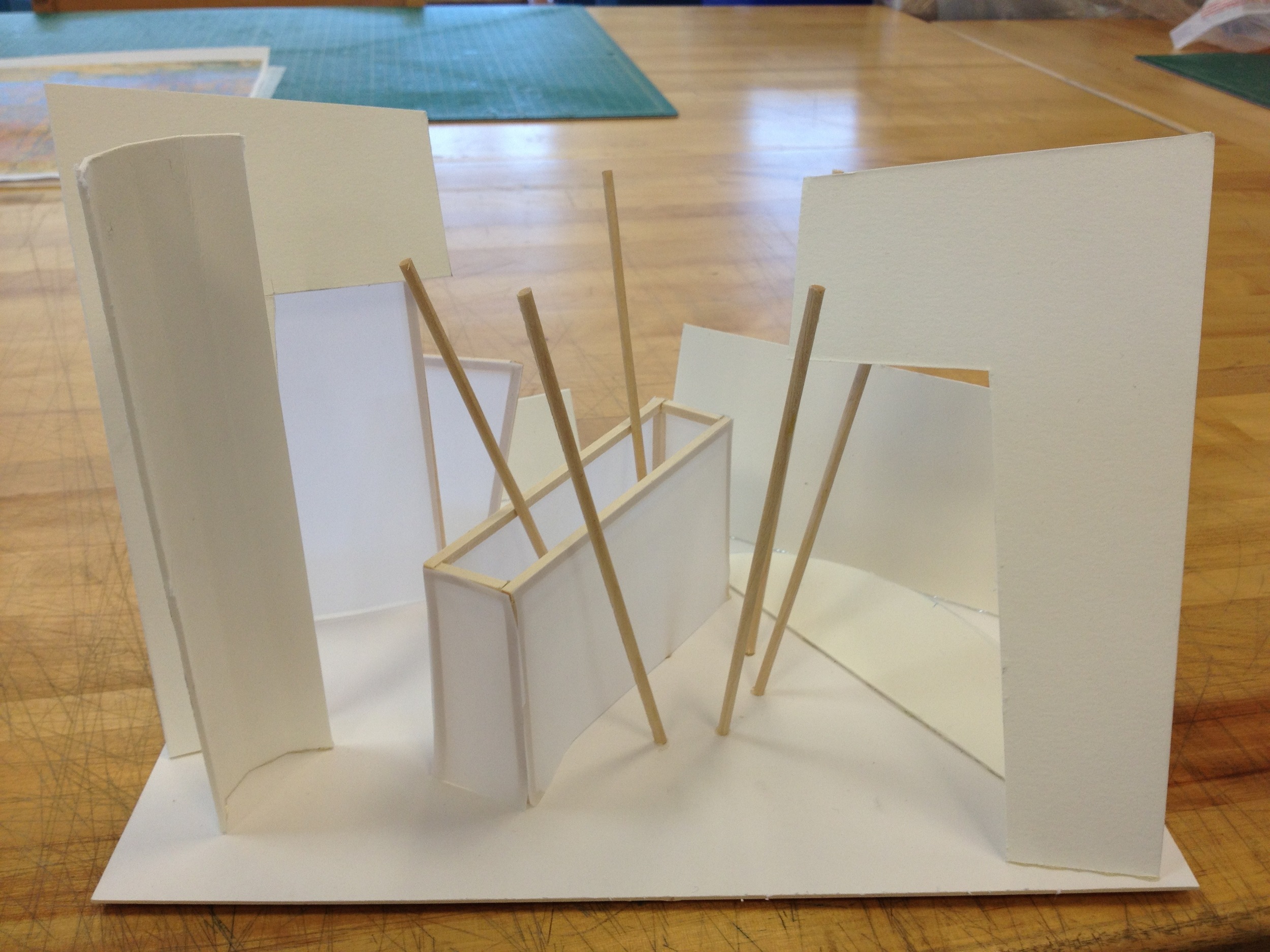
After a discussion during class it was found that the model (below), like the original Ben Nicholson Painting, was about objects being ambiguous about their placement in space. Ambiguity in this sense means it can be viewed equally in two ways. The Model:
Study Sketches:
Watercolor Interpretation:
Related articles
- Ben Nicholson April 1957 3D Interpretation (jeffsargis.wordpress.com)
Ben Nicholson April 1957 3D Interpretation
For our first studio assignment we reinterpreted the 3D space being depicted in a 2D piece of art. Ben Nicholson April 1957
Photo By Renzo Dionigi
Photo URL: http://www.flickr.com/photos/renzodionigi/3438501776/in/photostream/
His website: http://www.renzodionigiphoto.com/
Model interpretation
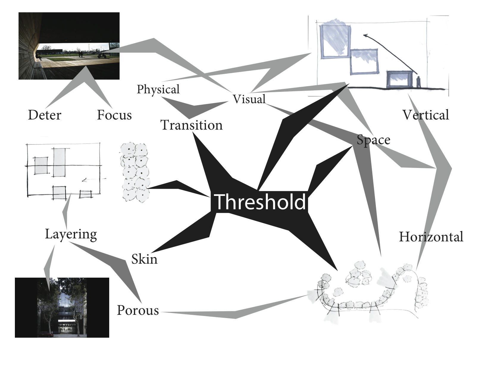
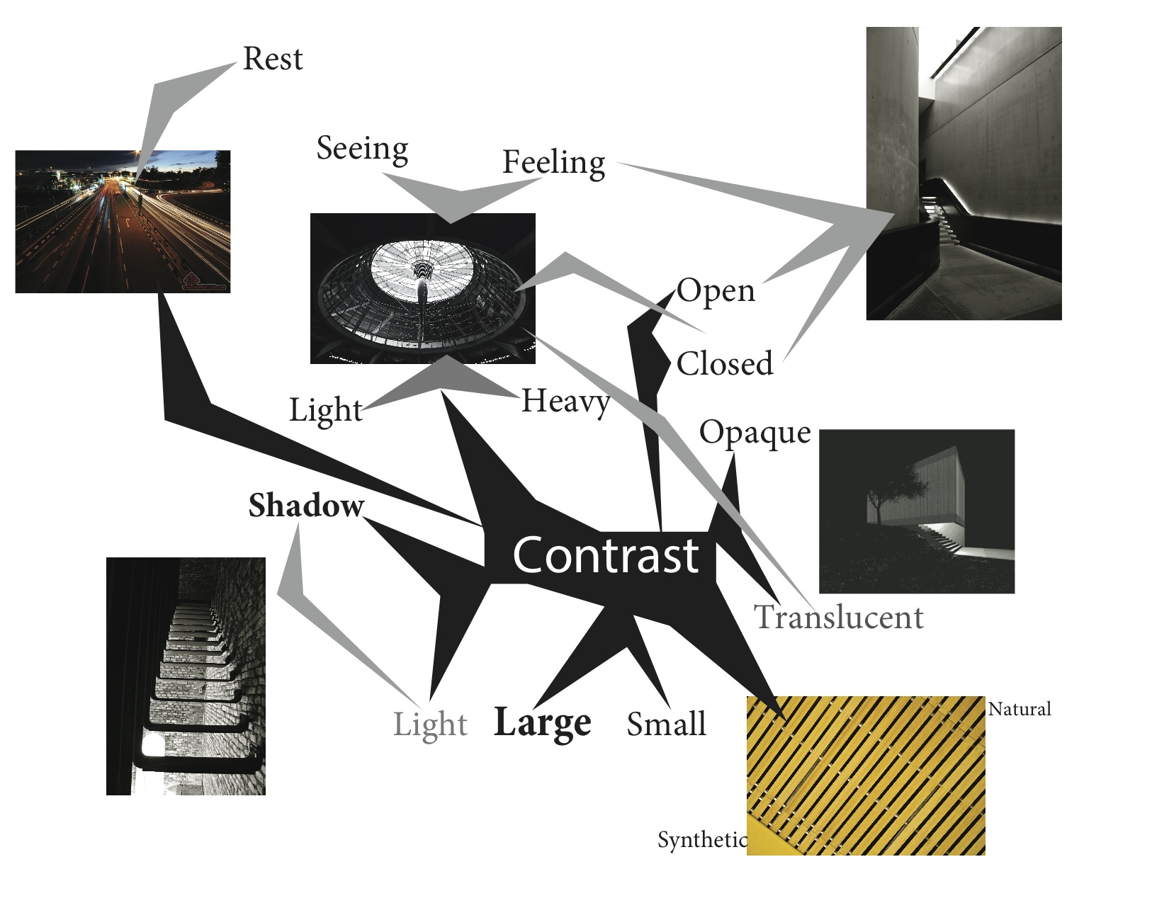
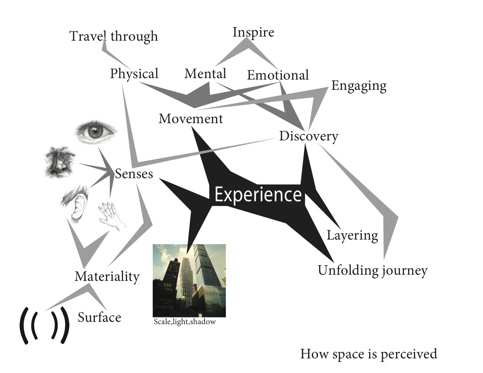
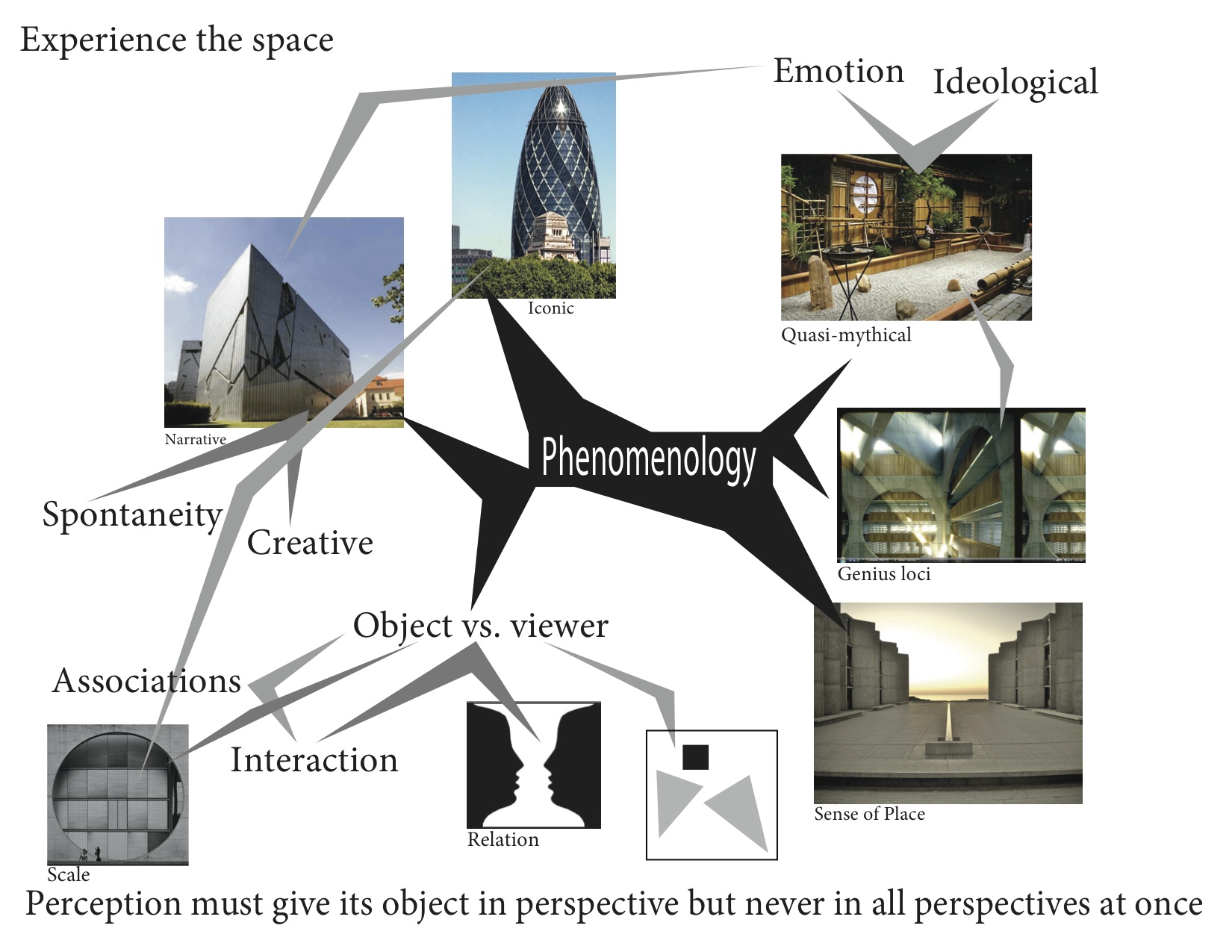
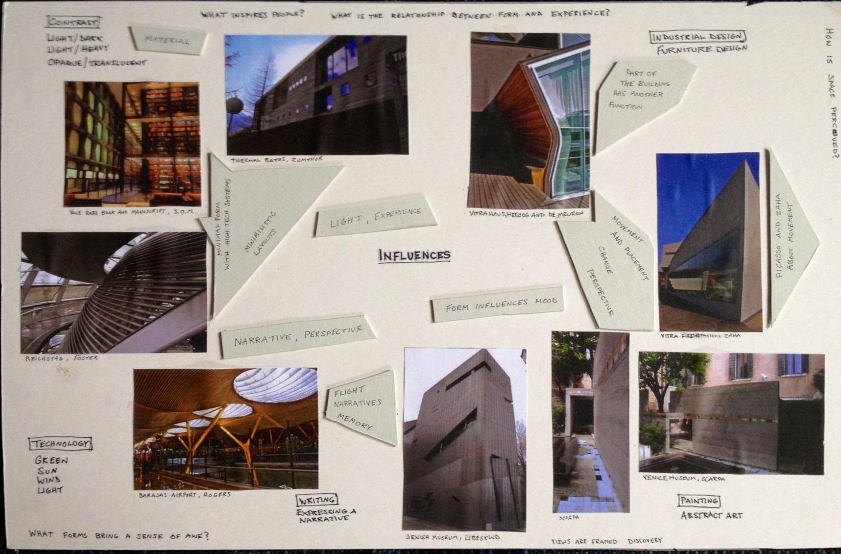
Thesis Prep 2 | Mind Maps
TP1: Assignment A | Compare and Contrast Essay 1
Both articles by Wang and Plowright, Stevens, and Adhya advocate using research to improve the design process, however in different ways. While they equally speak to the need of research Wang’s “Design in Relation to Research” seeks to prove that design and research are integral parts of one another. In contrast, Plowright, Stevens and Adhya’s “A Study of Process in Design: Curatorship, cloud intelligence and applied research” seeks to prove the need to share and use research in a society that demands more professional integration with architecture. Wang seeks to create a more successful design outcome by combining different methods of research. He cites an example of the method already in use “a multi method research approach that includes, at the tactical level, ethnographic, survey, participant design, and experimental methods” (Wang 1945, 125). In contrast, Plowright, Stevens and Adhya advocate the use of an inter-disciplinary transfer of knowledge to move the task of designing away from one designer and to a group of specialists. “Traditional disciplinary barriers often inhibit the acquisition of knowledge from beyond the boundaries of that discipline by defining territorial control, however openness is important” (Plowright et al. 2010, 3). They believe this combination of useful information will create an outcome that is in the best interest of the group of specialists. They argue to move design in a direction away from a sole designer and have only one objective of fulfilling the needs of the general public.
Both articles discuss how there is a scientific method that outlines how research is conducted and used in design. Wang focuses on how the person reaches out to gather information and test it against people and previous knowledge in the design process. He states, “the generative design process, on the other hand, emerges from other workings within human reason, workings that cannot be fully explained in a propositional way.” (Wang 1945, 105). In contrast,Plowright, Stevens and Adhya oppose the top down model and support the use of a free flowing organization to help spread needed resources. “Most structured organizations are, by definition, not able to be fully innovative as their own rigid structural shortcomings limit the range of possible answers before the question is even asked” (Plowright et al. 2010, 2). The views on how the design hierarchy is structured differ between the two articles and in how they see it impacting the design process.
After gathering information about the design process Wang and Plowright, Stevens and Adhya split on how they deal with this information. Wang describes methods to include and combine research results to create the most thorough design. He discusses how it is used to improve the designer himself, “Groat means to shift away from the model of the architect as sole technician or sole artist toward one that is sensitive to a larger communal mission of well-being” (Wang 1945, 117). On the other hand, Plowright, Stevens and Adhya, use case studies and run their own tests to show the benefits of a social network of information. “The goal is to allow for an environment of innovation by transferring research and knowledge from the periphery, where knowledge traditionally is housed in architecture, in a non-rigid structure” (Plowright et al. 2010, 5). In other words, the author wishes to create a combined professional field.
As discussed design and research are not living symbiotically as they should. Both articles support the increase and more careful use of information drawn from research. However, Wang advocates the personal use of combined research in order to improve design, while Plowright, Stevens and Adhya wish to see research spread with technology to inform the masses and to incorporate larger professional fields. They both advocate the need for research but differ on how to use it most effectively. Their ideas clash by their focus to improve the designer versus having teams of specialist combine a network of information to procure the best result. They differ in their views of who should be learning and contributing to the design. Wang advocates the practice of a more informed sole designer while Plowright, Stevens, and Adhya argue for a larger team of specialists. Both agree that research is vitally important and that it should contribute to the field.
Bibliography
David Wang, “Design in Relation to Research,” Architectural Research Methods by Linda Groat and David Wang. (New York, New York: John Wiley and Sons, 1945), 99-131
Philip Plowright, James Stevens, and Dr. Anirban Adhya, “A Study of Process in Design: Curatorship, cloud intelligence and applied research” (2010). http://info.aia.org/arcc/program/program.html
TP1: Architectural History or Landscape History?
"Architectural History or Landscape History?"By Dell Upton, University of California Berkeley
- Citation: Dell Upton. “Architectural History or Landscape History?” Journal of Architectural Education. (1984-), Vol. 44, No. 4. (Aug., 1991), pp. 195-199.
- Argument: Upton argues that architectural history has been a biography of designers and instead should encompass human experience and social interaction to evaluate work.
- Author: Dell Upton was educated at Colgate and Brown. He earned his Ph.D. American Civilization, at Brown University; a M.A. American Civilization, at Brown University and a B.A. History, English, at Colgate University. He is a Professor of various courses focusing on the architectural and the cultural. He was a consultant and chief catalogue essayist for the Metropolitan Museum of Art’s 2000 exhibition Art and the Empire City: New York, 1825-1861. Upton has a multitude of published works including: Another City: Urban Life and Urban Spaces in the New American Republic 2008, Architecture in the United States 1998, Holy Things and Profane: Anglican Parish Churches in Colonial Virginia 1986. He is also working on a world history of architecture. (http://www.arthistory.ucla.edu/people/faculty/dupton/)
- Method: Upton argues that architectural history has been a biography of designers and instead should encompass human experience and social interaction to evaluate work. Dell Upton makes his argument by describing how previous accounts of architectural history are more a biography of the designer and builder. How each time period is viewed is marked by a certain building or designer. This way of defining history lacks a focus on the human made environment. He cites sociological analysis to support his claim. For example, “defining a distinctive realm of expertise and of devising a mechanism for limiting entrance to its practice.” This source elaborates on how professionalism started and the tools it uses to be more exclusive. The universal notion of style has been refined and preserved since the renaissance by people who are not part of vernacular and who gained professional status from certain education and training. Upton looks extensively into sociological writings on cultural hierarchy to explain why some works are considered aesthetically pleasing and others not.
- Key words: Human landscape, cultural landscape, perception
- Map: Please see Mind Map attached.
- Evaluate: Sources selected: “Aesthetics as an Intellectual Network” by Casey Haskins and “Space and the Perception of Time”by Victoria Meyers
- Rationale: “Aesthetics as an Intellectual Network”by Casey Haskins branched off from Upton’s ideas of the notion of aesthetics being created by the high cultured professionals. He argues that aesthetics of all kinds including art and music are monopolized and governed by a select group of high cultured professionals. He believes philosophical aesthetics is shared throughout all of the creative fields and he argues that they play off each other. “Space and the Perception of Time”by Victoria Meyers branches off the keyword perception that I selected from Upton’s article. She discusses how light, shadow, and textures affect the user’s perception and how it can be manipulated. Haskin’s ideas of high culture contribute to Upton’s thesis by reaffirming his claim that professionals in their fields produce our preconceived notion of aesthetics. While Meyer’s concepts on perception outlines the characteristics needed to create the human experience and social interaction Upton asserts is needed to evaluate architectural work.
What are my architectural interests?
SCI-Arc Thesis Week 2011
[vimeo http://vimeo.com/29126183]
Containers of Hope, a $40,000 Home by Benjamin Garcia Saxe
This project shows what modern architecture can be: a reasonably priced piece of work that can fulfill the client's needs, be environmentally friendly, and also aesthetically pleasing.
Benjamin Garcia Saxe has recently completed the Containers of Hope project with a budget of $40,000.
Located in San Jose, Costa Rica this container house is the result of a close collaboration between the architect and his clients, who went on to construct the building themselves.
The 1,000 square foot home is composed of two 40-feet used shipping containers set together with a raised mid section and clerestory windows.


Containers of Hope by Benjamin Garcia Saxe Architecture:
“Gabriela Calvo and Marco Peralta dreamed of living in their fantastic property 20 minutes outside of the city of San Jose, Costa Rica; where they could be with their horses and enjoy the natural landscape. They made the very bold choice of exploring with me the possibility of creating a very inexpensive house made out of disregarded shipping containers that allowed them to be debt free and live the life they always dreamed of.
It was important for me to provide them with the sunrise, the sunset, the spectacular views, and overall try and create a feeling of comfort and home. A roof between the two containers, made from the scrap pieces of metal taken to make the windows, not only creates an internal sensation of openness but also provides a cross ventilation which is surprisingly sufficient enough to never have to turn the air conditioning on.


The final cost of the house ($40,000) is lower than the cost of social housing provided for the poor in Costa Rica. Perhaps this project begins to expose the importance of design as a tool to provide beauty and comfort with a very low budget in the 21st century, whilst using creativity to not only redefine a scrap material such a disused shipping container, but perhaps to even show that there are viable, low cost, passive alternatives of temperature control to adapt to a very intense tropical climate.”
Already this proposal has began to spark a great deal of interest and could become one alternative to solve the issue of disposing of disregarded shipping containers in developing countries, as well as begin to solve the large gap which first time buyers encounter when purchasing a home.”
Source: http://www.homedsgn.com/2011/06/16/containers-of-hope-a-40000-home-by-benjamin-garcia-saxe/
The city of tomorrow today?
Niagara Falls Hydraulic Scheme

ingrid siliakus: paper architecture
http://www.designboom.com/weblog/cat/10/view/18555/ingrid-siliakus-paper-architecture.html working with paper, amsterdam-based artist ingrid siliakus creates miniature works of architecture with highly intricate details. the three-dimensional pieces incorporates the structural nature of a 90 degree angle to delineate, in a manner resembling pop-up books, a skyline, clusters of buildings, network of stairs, and more. the effect is often dizzying and evoke the aesthetic of M.C. escher with its orthogonal read. delicate yet solid in its build, some of the paper sculptures are capable of collapsing down into a two-dimensional pack.


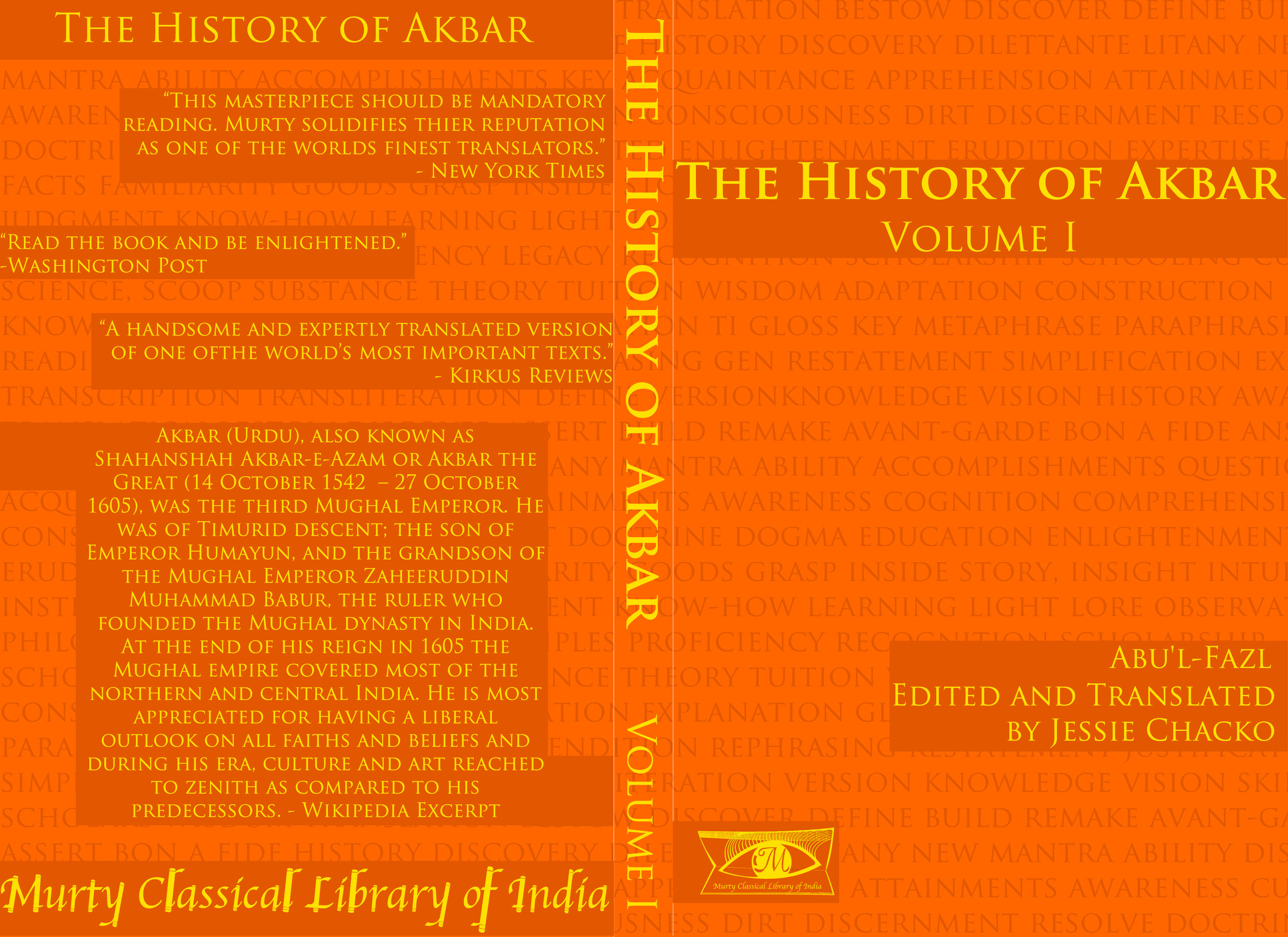
Murty Classical Library Competition
Harvard in collaboration with Murty Classical Library of India had a competition. To create a Book Jacket, Logo, and Logotype
I've never done graphic design but here was my first pass.
Related articles
- Murty Classical Library scouting for translators (thehindu.com)
Morning Frost
Análisis de Formas | Blog de la asignatura Análisis de Formas de la Escuela de Arquitectura de la Universidad de Navarra
Architecture as void
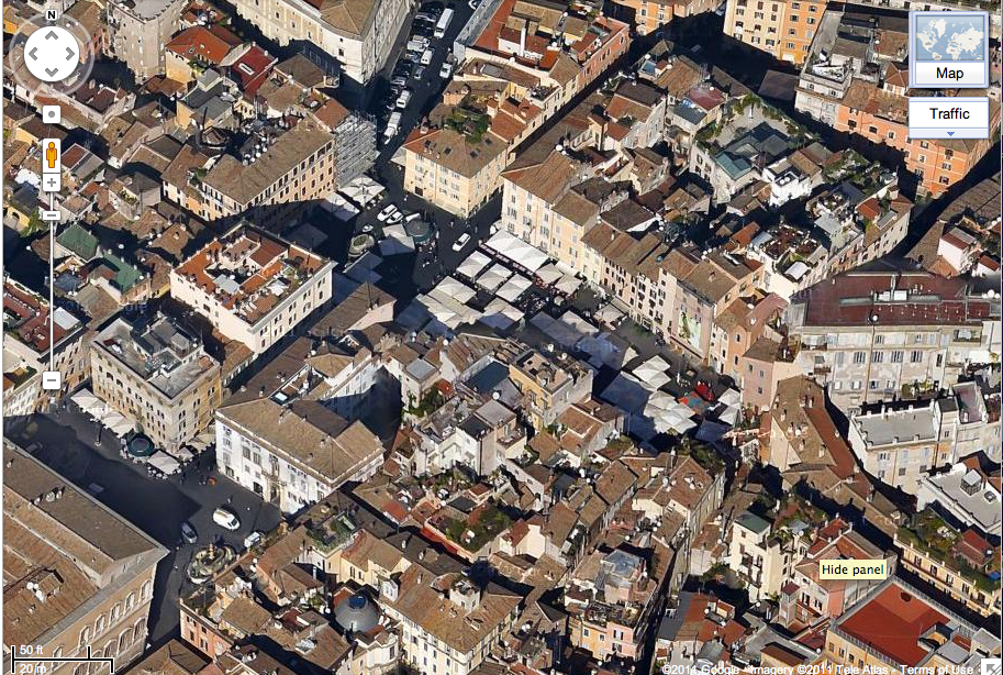
Massing models, form and space. What is architecture really? Well a wall is a wall and we can all agree to that, but the wall isn’t the most important part of the space, the part we reside in, the part we notice, the part we move through, is the void. When people enter a space they comment on the feel of it, the openness, the light, the smallness of it. Rarely a comment is “I like the direction of the walls” more of how the wall influence the nothingness of the space. The walls may direct your eye but the focus is usually to a space beyond, next to, or around it. It’s placement, position, and form all influence on how the space is shaped. It can be used to frame, block or embellish various spaces. Indeed mass and void engage in a symbiotic relationship but it is within the void that creates the notable change in a person’s reaction to it. Doors and windows are appreciated because they transition us through space, either physically or visually. But they also are a non-entity; besides the windowpane and door that act as protection from the outside they still are the void in the wall or roof of which they reside.
In terms of Urbanism:
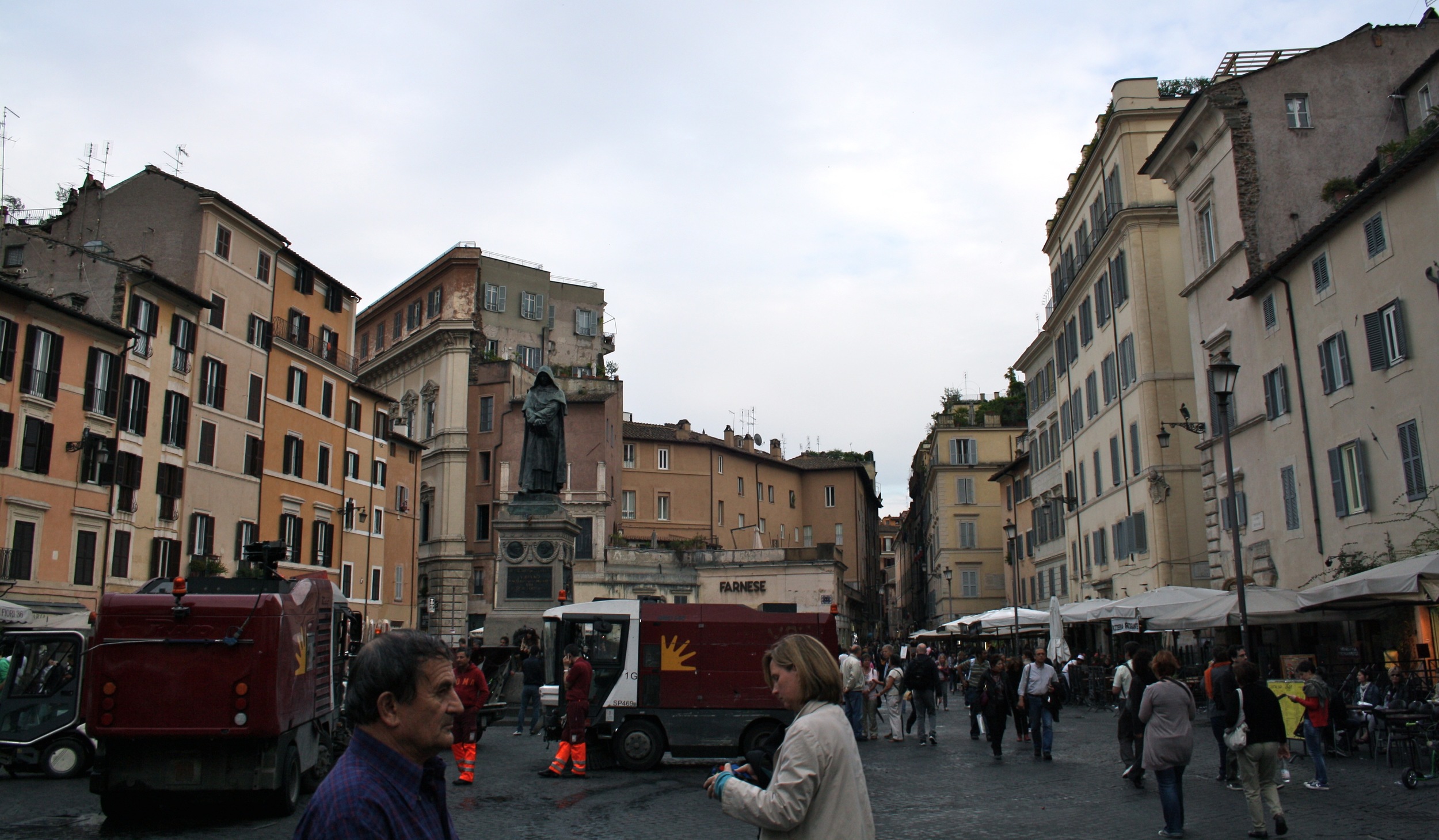
People appreciate what is not there; a park is a park because it is a break in the forest, an open patch of grass. A plaza is appreciated because it is a break in the urban fabric, people can move, gather, and use the nothingness that is the open space in urban fabric. The ability to have nothing there allows for the inhabitants to fill it in any way they see fit (laws permitting), with carts for selling items, chairs for viewing the surrounding activities, or an area to run and catch a Frisbee.
Arial view of Roman Campe de Fiori (Center) and Piazza Farnese (Bottom Left)
Camp de fiori after market clean up. Getting ready for the nightlife.
On the contrary too much void can be distressing for people. Structured open spaces are appreciated because of their break in the dense fabric surrounding it. Overly wide-open spaces can pull away from the human scale. Trees vegetation and other “human scale” elements may work vertically but not horizontally. For example it is much easier to walk twenty NYC block then it is to walk from one farm to the next a mile away.
So architecture needs the mass to create the void and the mass must be carefully crafted and detailed, but the mass must also serve as the means to mold a well thought out void.
Fall: The Beginning of Change
What is it about fall? For some reason I always have these good feelings about it. I know it is the end of summer; beaches, warmth and most outdoor activities will be winding down, with the impending snowfall of later months. Maybe it’s the crisp air that’s awakening, maybe it’s the apple ciders, the change of colors in the trees, the rustling and crunching of leaves beneath your feet. Maybe I just like wearing the light sweater and jackets I have not seen for months. Maybe it’s all the people walking around admiring the change of colors, trying to stay outside as much as possible before the winter keeps them indoors. Maybe it’s the temperature, it's not too cold or too hot, the medium temperatures are perfect for wandering about it's not too hot, muggy or cold you don’t feel like you have to rush indoors to be air-conditioned or in the warmth of your house.
Maybe it's because in the fall school has always started for me, a new year new people, the change of relationships, the beginning of new ones, new information to learn.
Whatever it is I always have this excited uplifted feeling when fall arrives, so I guess it’s time to zip up my light sweatshirt, grab a hot cider, and bring on the change to come!

new disregarding old
it would seem in more and more some graphic design is leaning towards not using capitals. i like it, it does seem modern for some reason. but after all, modern usually is breaking the rules. look at renoir, monet, van gogh, and picasso to name a few, all were painters who decided to look upon their approach to art differently and break away from the traditional idea of how a painting should be. so what if this really takes off? would we really see the disappearance of capitals? well not for a while these things take time but i would not be surprised if we did see them go the way of the dodo bird. architects would be mad, after all they exclusively write in caps. although when professions outside the construction field use all caps it seems like they are yelling. i'd like to meet the person who initiated that idea, it probably went down like this:
"ok write the letter to them and i want them to know i'm mad!"
"alright, and how do i write it mad?"
"i don't know... uh put it all in caps.. yeah no one uses all caps they definitely will know i'm yelling; use a lot of exclamation points!"
on the receiving end - "hey.. uh this guy sent the letter to us, all in caps.. why's that?"
"eh his caps lock is probably on"
"no.. i think he's mad.. maybe yelling. big words = say them loud.. should i yell the message to you then?"
"no just put him in the junk folder.."
all things considered this post has been much easier to write without having to capitalize anything. my pinky fingers are at ease not having to stretch the odious 1/8 of an inch to reach the godforsaken shift key. say, i might even be able to do the "dr. evil pose" more effectively with my pinky finger so rested!
well except for the punctuation problem, in which quotes, exclamation points, and a number of others still require the shift key. well, i'm sure new keys will come later.
plus as a bonus it makes everything look cool and casual. so casual in fact i am writing this in a hawaiian t-shirt, making margaritas, and talking to my parrot!
ok i don't actually have a talking parrot..
The Need to feel important
"...an uneducated, poverty-stricken grocery clerk to study some law books he found in the bottom of a barrel of household plunder that he had bought for fifty cents. You have probably heard of this grocery clerk. His name was Lincoln." Carnegie, Dale (2010-08-05). How To Win Friends and Influence People (p. 19). Simon & Schuster. Kindle Edition.
I came across this excerpt while reading and found it very interesting. I was knew that Lincoln studied law and came from a humble background but I guess I didn't realize how it actually came about. Now if a poor grocery clerk can study law and become president surely I can achieve my goals as well. Determination and focus helped him become what he is known in history as.
This reading describes the reason for him doing all this as the need to feel important. I'm not sure if I can entirely agree, sure everyone wants to feel important and needed but there must have been something else at work here. Lincoln must have had an urge to help, to change, to lead. Was he just bored with the grocery store? Did he have some desire to leave the world better than when he came to it? Well I'm not sure but maybe a historian knows but Lincoln is the only one who knows for sure why he did it.
Maybe he just wanted to be a boss...


![photo[2] copy](http://static.squarespace.com/static/521118dde4b01a5565d6d275/52129998e4b0031894752801/5212999be4b00318947528ed/1347634638000/photo2-copy.jpg?format=original)
![photo[1]](http://static.squarespace.com/static/521118dde4b01a5565d6d275/52129998e4b0031894752801/5212999be4b00318947528ea/1347634411000/photo1.jpg?format=original)
