TP: 2 Landmarks and Surroundings Analysis
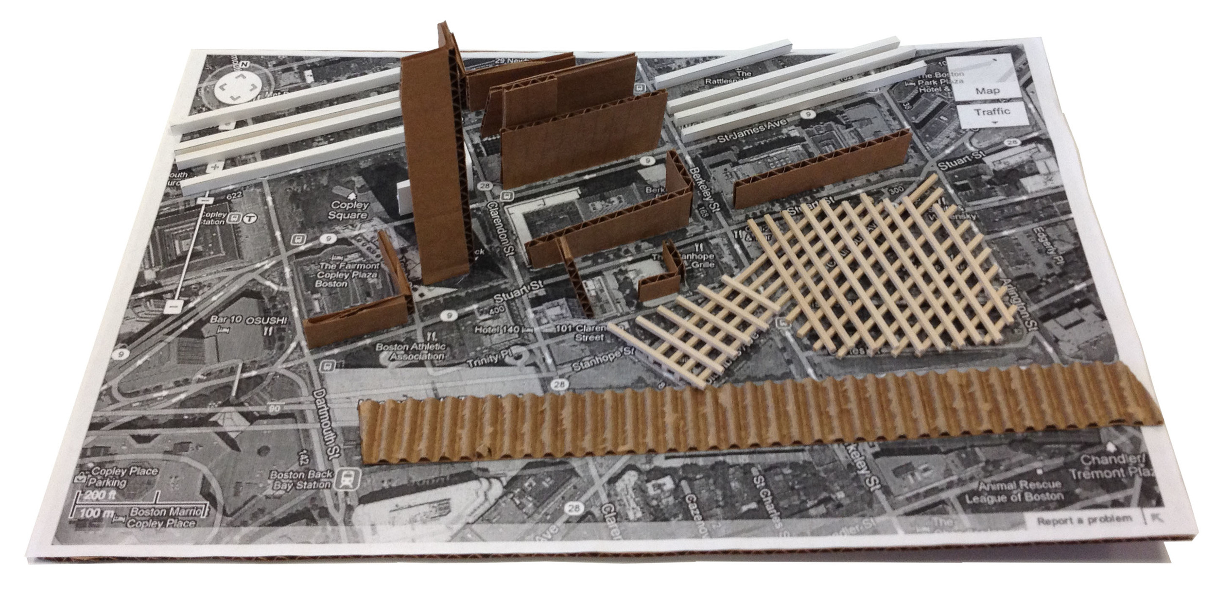
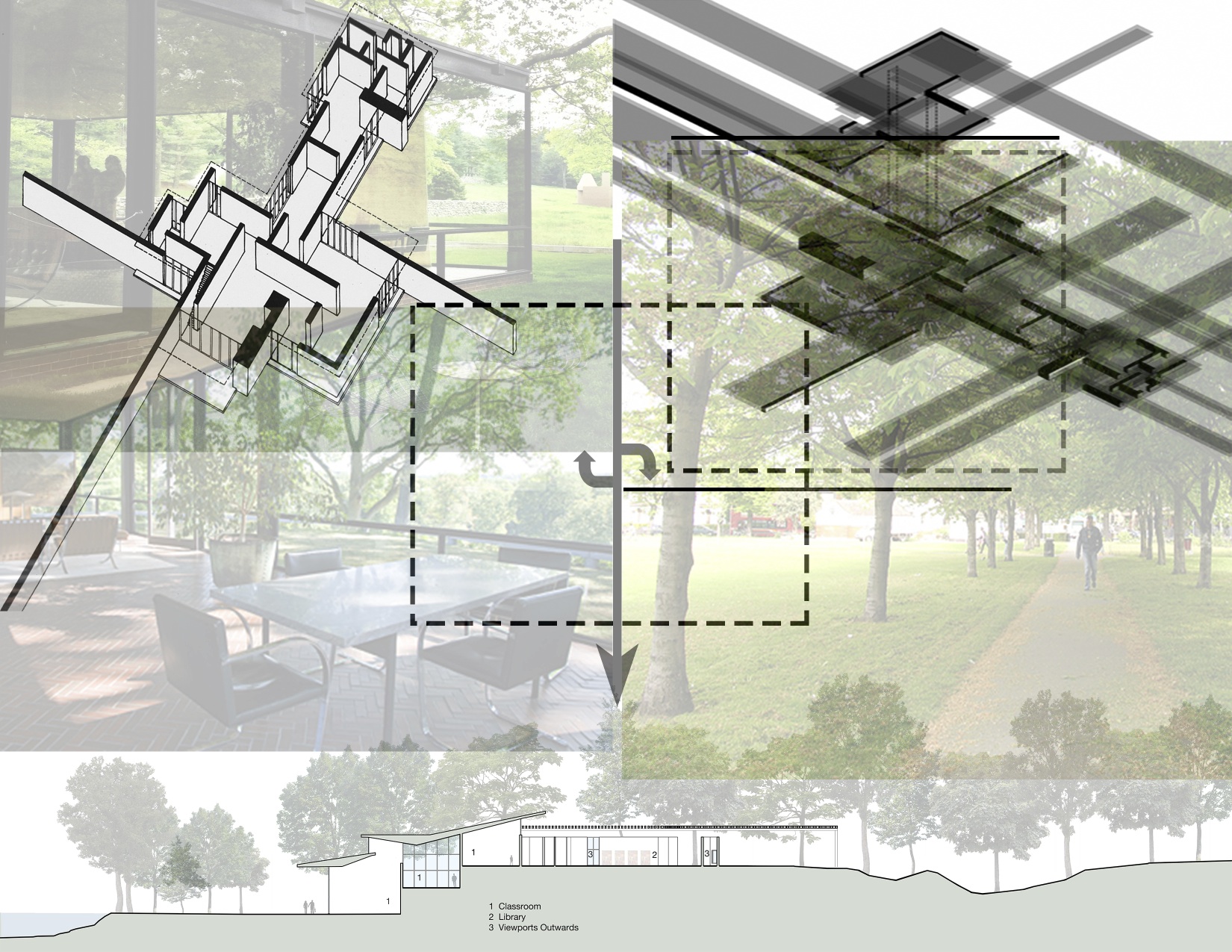
In continuance of the site exploration it was necessary to observe the surrounding conditions. Utilizing waypoints the proposed site uses surrounding landmarks and buildings like the walls in the preliminary study models are used. These landmarks will pose as an untagible boundary that increases the perceived size of the space and creates a continuation of space.
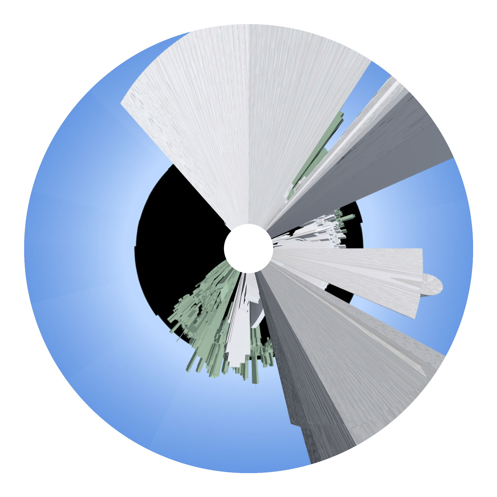
TP2: Site
During the site explorationg process a series of site qualities were established. This consisted of a smaller site in the sense of square footage, and located within an area that was dense but also allowed for views beyond the immediate area. After studying three sites the site at 380 Stuart Site was chosen for its variety in height, density and program. This site is adjacent to neighborhoods that have landmark buildings density and areas for growth to use as references to mark the buildings limits and extends.
Site analyzed:
380 Stuart Street
Back Bay
This site satisfied the density qualitites necessary, the variety of heights, denisty and uses.
Site analyzed:
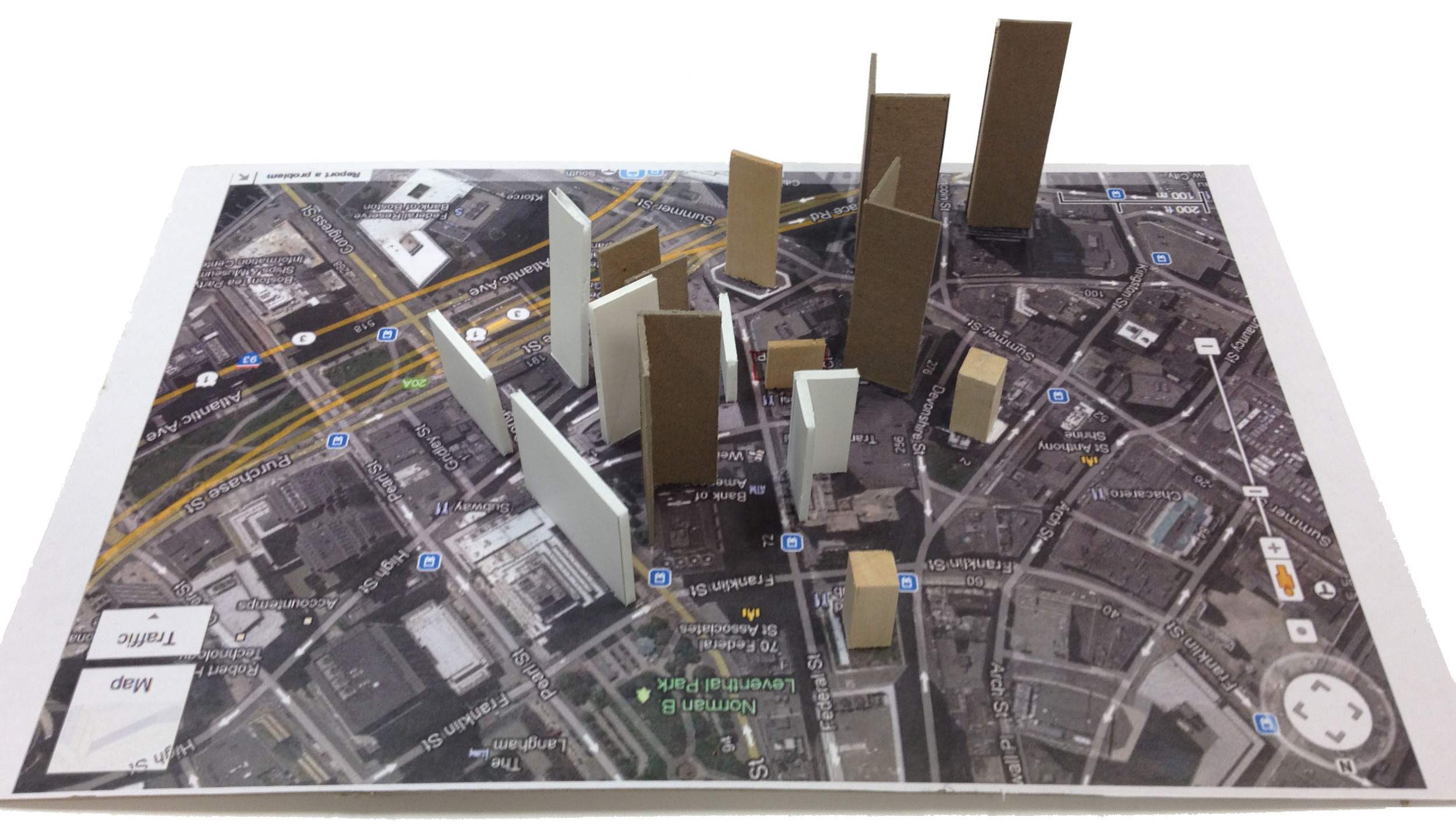
Fedaral Street and Milton Place
Boston Financial District
This site satisfied the density qualitites necessary but lacked a variety of heights, denisty and uses.
Site analyzed:
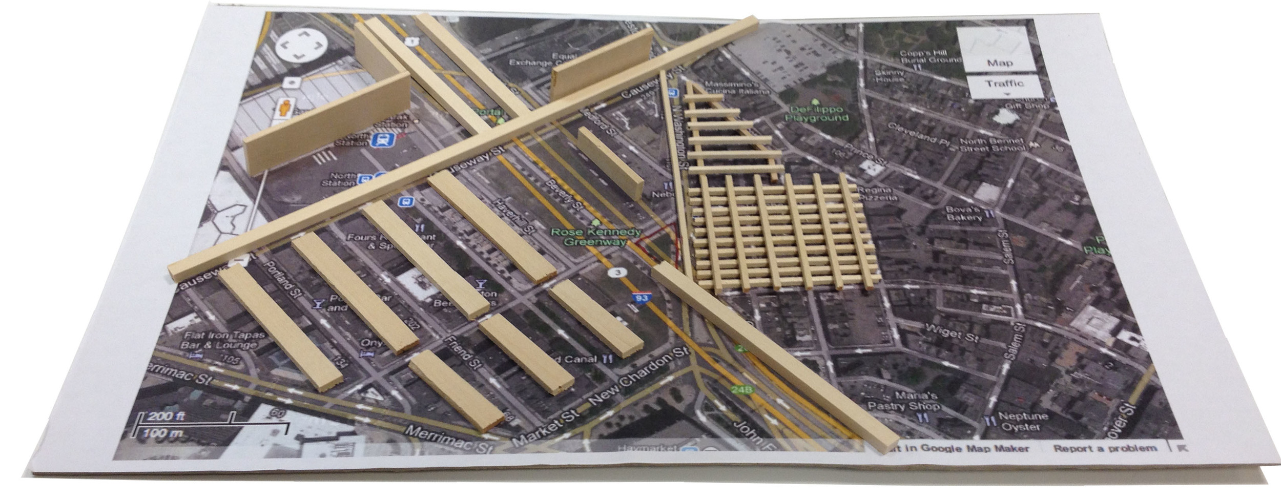
Valenti Square. North Washington Street and Beverly Street
Rose Kennedy Greenway
This site satisfied the small square footage but lacked a variety of heights, denisty and uses. The site was too open in it’s surroundings and lacked connections to areas around it.
RESUBMISSION: TP1: Assignment B: Contemporary Discourses / Compare and Contrast Essay 2
Reflection
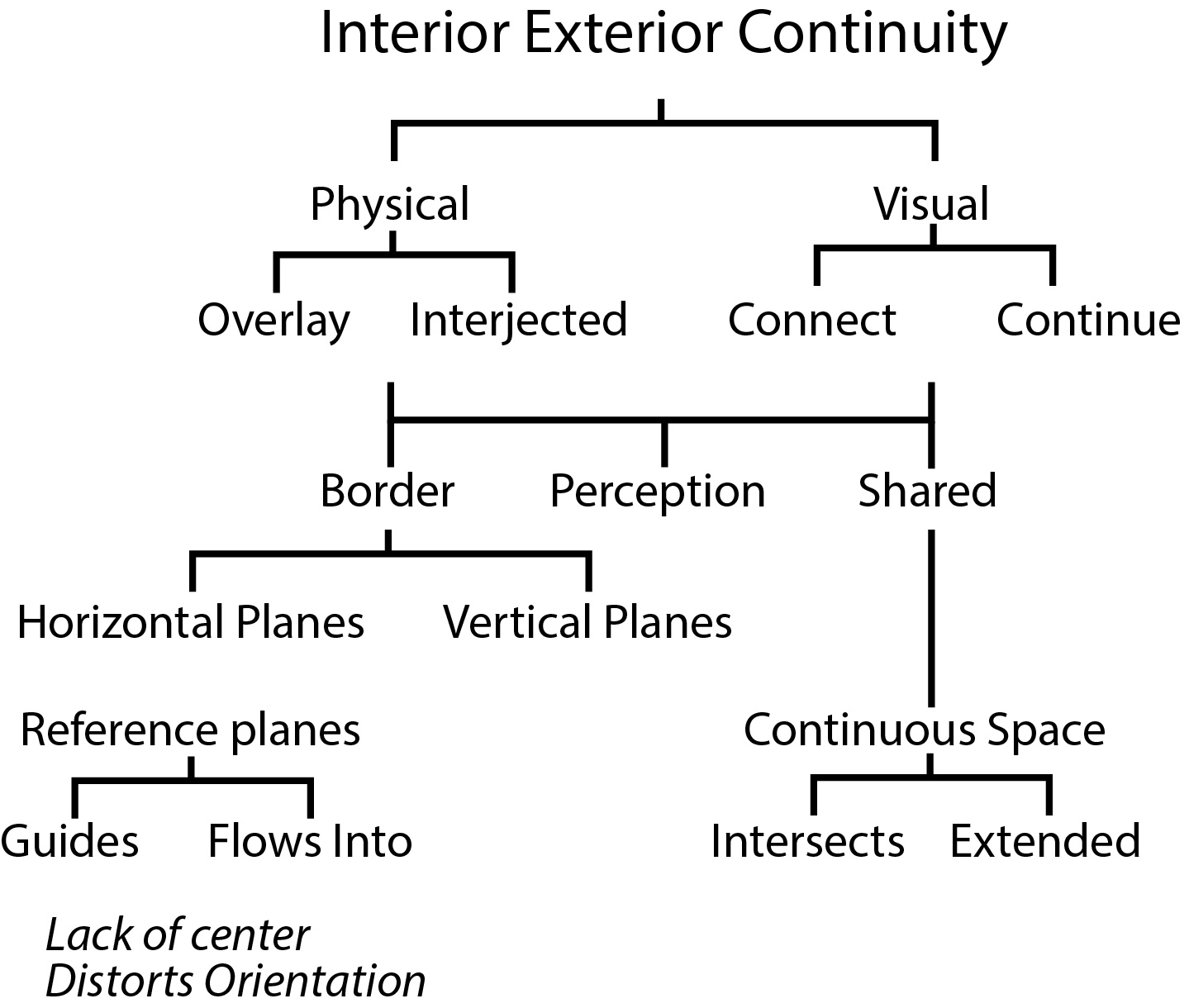
The two readings chosen for this assignment inform my thinking about my thesis question by helping me to discover how I wish to research and support my thesis topic. What I wish to learn from my thesis question is about the continuity of interior and exterior spaces. Frampton’s article reveals the uses and general theories on tectonics, which I can apply to my thesis developing the use of a building’s material language to denote interior and exterior spaces. Blau’s article teaches how transparency, both literal and visual, can cause the occupant to feel as if the adjacent spaces are connected. This understanding provides a tool to aid my research in creating continuity between interior and exterior spaces.
The two sources “Introduction to Studies in Tectonic Culture” by Kenneth Frampton and “Transparency and the Irreconcilable Contradictions of Modernity” by Eve Blau, recognize a poetic non-visual non-literal aspect of tectonics. However, Frampton focuses on the “traditional” phenomenology of tectonics, while Blau speaks on the abstract perception of spaces. Frampton's theory is on the relationships between the user and the material and structure. He cites examples of Japanese architecture, religious buildings and municipal buildings and how materials define space and engage the inhabitant. Blau’s views are similar, however, she focuses on how the ambiguity of transparency that alters an individual’s perception of the space. The user’s perception of the space’s program is constantly in motion, much like a film montage of the building’s daily programmatic lifespan. The sources both speak to how tectonics are used to create literal and phenomenological space but they differ in their abstraction of it. Frampton's focus if on the physical qualities of the materials but Blau focuses on the phenomenas that occur in between the viewer and material.
In Frampton’s “Studies in Tectonic Culture” he asserts that we view space by reorganizing it based on past knowledge, that our movement into space defines it, and that structure and construction can vary the space’s expression. Frampton claims that based on our past experiences we reorganize and view a space as it has been before and theoretically should be now. “The body reconstitutes the world through its tactile appropriation of reality” (Frampton 1995, 10). He goes on to argue that tectonics create a defined space that we evaluate while we move forward into its volumes. “Our concept of space is determined by the frontalized progression of the body through space in depth” (Frampton 1995, 11). Frampton believes that a building’s expression can vary and is defined by subtle changes in its structural and material relationships. “Combinations of structure and construction could become the occasion for a subtle variation in expression” (Frampton 1995, 20). His views are constrained to a more traditional view of tectonics, one where the literal guides perception.
Eve Blau’s “Transparency and The Irreconcilable Contradictions of Modernity” argues that tectonic transparency creates literal and phenomenological spaces that have a complex layering, that move between realism and abstraction. Blau also states that these layered spaces have structural systems that when both visually and literally join they become a fully integrated work. Blau asserts that the layering of juxtaposed spaces causes them to blur into one another creating a complex interpretation of which space is positioned, without favoring one over another. One example she draws heavily upon is the Barcelona Pavilion where the walls and rooms are used as association points and not literal barriers. The Pavilion uses the juxtaposed spaces to bleed foreground and background together. “A quality of spatial organization that is ambiguous, generated by the simultaneous perception of different spatial locations and superimposed forms that appear to interpenetrate without optically destroying each other” (Blau 51). She argues that the spaces move between realism and abstraction because of the context in which they are viewed in relation to the whole of the building. For example a buildings layout can be viewed as a montage of different uses. “A conception of transparency as a function of montage: a compositional strategy of de-contextualization and re-contextualization the problematized and foregrounds the dialectical relationship between realism and abstraction” (Blau 52). Blau claims that when the literal structure and visual structure intertwine the result is a form that is perfectly complete as a whole. For example, “Mies integrates his two structural systems visually so that, perceptually, the discrepancies between them become invisible and the whole seems to cohere into a perfectly balanced and fully integrated autonomous work of art” (Blau 57). Her views on perception are founded in the abstract and how clarity can be altered and questioned.
As discussed, tectonic expression is prominent in both articles but the idea differs in how its use is executed. Kenneth Frampton takes a more traditional approach on how tectonics and materiality are expressed. His views are more realistic than abstract due to the concept of how materials express the space and move the person throughout it. Eve Blau discusses using transparency to blur and restructure the spaces causing the person to constantly be reassessing their understanding of the space. Her views on perceived space and programmatic uncertainty create an abstract dynamic dialogue between the user and the designed layout. Her approach differs from Frampton because the phenomenas she tries to explain cause the user to read in between the structure and materials of the building. Frampton asserts that the actual materials are what the user reads to create the space. The two approach's main difference is their focus on the building displaying what it's spaces are versus the user seeing the building's spaces as what they think they are. Both articles articulate the profound influence different types of tectonics have on the occupant.
Bibliography
Blau, Eve. “Transparency and the Irreconcilable Contradictions of Modernity,” PRAXIS 9 (fall 2007): 50-59
Frampton, Kenneth. “Introduction to Studies in Tectonic Culture: The Poetics of Construction in nineteenth and Twentieth Century Architecture” Edited by John Cava (Cambridge and London: MIT Press), 1-27.
RESUBMISSION: TP1: Summer Assignment: Architectural History or Landscape History?
“Architectural History or Landscape History?”By Dell Upton, University of California Berkeley
- Citation: Dell Upton. “Architectural History or Landscape History?” Journal of Architectural Education. (1984-), Vol. 44, No. 4. (Aug., 1991), pp. 195-199.
- Argument: Upton argues that architectural history has been a biography of designers and instead should encompass human experience and social interaction to evaluate work.
- Author: Dell Upton was educated at Colgate and Brown. He earned his Ph.D. American Civilization, at Brown University; a M.A. American Civilization, at Brown University and a B.A. History, English, at Colgate University. He is a Professor of various courses focusing on the architectural and the cultural. He was a consultant and chief catalogue essayist for the Metropolitan Museum of Art’s 2000 exhibition Art and the Empire City: New York, 1825-1861. Upton has a multitude of published works including: Another City: Urban Life and Urban Spaces in the New American Republic 2008, Architecture in the United States 1998, Holy Things and Profane: Anglican Parish Churches in Colonial Virginia 1986. He is also working on a world history of architecture. (http://www.arthistory.ucla.edu/people/faculty/dupton/)
- Method: Upton argues that architectural history has been a biography of designers and instead should encompass human experience and social interaction to evaluate work. Dell Upton makes his argument by describing how previous accounts of architectural history are a biography of the designer and builder. He asserts that each time period is viewed and marked by a certain building or designer. This way of defining history lacks a focus on the human made environment. He cites "Sociologists of the professions" but he does not specifically name any in particular, who support his claim. For example, “defining a distinctive realm of expertise and of devising a mechanism for limiting entrance to its practice” (Upton 1991, 2). He claims this to be how professionalism started and the tools it used to be more exclusive. The universal notion of style has been refined and preserved since the renaissance by people who are not part of vernacular and who gained professional status from certain education and training, most notably scholars who are also professionals in the field. Upton's claims that supporters of the "self-interested paradigm" were from the middle class and accepted this cultural hierarchy which explains why some works are considered aesthetically pleasing and others not.
- Key words: Human landscape, cultural landscape, perception, vernacular
- mind map
- Evaluate:
- Sources selected: “Aesthetics as an Intellectual Network” by Casey Haskins and “Space and the Perception of Time”by Victoria Meyers
- Rationale: “Aesthetics as an Intellectual Network”by Casey Haskins branched off from Upton’s keyword of cultural landscape in how high cultured professionals dictate what is considered aesthetically pleasing and what styles are deemed successful. He argues that aesthetics of all kinds including art and music are monopolized and governed by a select group of high cultured educated professionals. Haskins believes philosophical aesthetics is shared throughout all of the creative fields and he argues that they play off each other. “Space and the Perception of Time”by Victoria Meyers branches off the keyword perception that I selected from Upton’s article. She discusses how light, shadow, and textures affect the user’s perception and how it can be manipulated. Haskin’s ideas of high culture contribute to Upton’s thesis by reaffirming his claim that professionals in their fields produce our preconceived notion of aesthetics. While Meyer’s concepts on perception outlines the characteristics needed to create the human experience and social interaction Upton asserts it is needed to evaluate architectural work.
- Bibliography
Dell Upton. “Architectural History or Landscape History?” Journal of Architectural Education. (1984-), Vol. 44, No. 4. (Aug., 1991), pp. 195-199.
Haskins, Casey. "Aesthetics as an Intellectual Network ." Journal of Aesthetics & Art Criticism 69, no. 3 (Aug 2011): 297-308.
Meyers, Victoria. "Space and the Perception of Time." Journal of Architectural Education 53, no. 2 (Nov 1999): 91-95.
TP2: Exercise 3.1: Revised Question, Image, And Mind Map
SCI-Arc Thesis Week 2011
[vimeo http://vimeo.com/29126183]
Containers of Hope, a $40,000 Home by Benjamin Garcia Saxe
This project shows what modern architecture can be: a reasonably priced piece of work that can fulfill the client's needs, be environmentally friendly, and also aesthetically pleasing.
Benjamin Garcia Saxe has recently completed the Containers of Hope project with a budget of $40,000.
Located in San Jose, Costa Rica this container house is the result of a close collaboration between the architect and his clients, who went on to construct the building themselves.
The 1,000 square foot home is composed of two 40-feet used shipping containers set together with a raised mid section and clerestory windows.


Containers of Hope by Benjamin Garcia Saxe Architecture:
“Gabriela Calvo and Marco Peralta dreamed of living in their fantastic property 20 minutes outside of the city of San Jose, Costa Rica; where they could be with their horses and enjoy the natural landscape. They made the very bold choice of exploring with me the possibility of creating a very inexpensive house made out of disregarded shipping containers that allowed them to be debt free and live the life they always dreamed of.
It was important for me to provide them with the sunrise, the sunset, the spectacular views, and overall try and create a feeling of comfort and home. A roof between the two containers, made from the scrap pieces of metal taken to make the windows, not only creates an internal sensation of openness but also provides a cross ventilation which is surprisingly sufficient enough to never have to turn the air conditioning on.


The final cost of the house ($40,000) is lower than the cost of social housing provided for the poor in Costa Rica. Perhaps this project begins to expose the importance of design as a tool to provide beauty and comfort with a very low budget in the 21st century, whilst using creativity to not only redefine a scrap material such a disused shipping container, but perhaps to even show that there are viable, low cost, passive alternatives of temperature control to adapt to a very intense tropical climate.”
Already this proposal has began to spark a great deal of interest and could become one alternative to solve the issue of disposing of disregarded shipping containers in developing countries, as well as begin to solve the large gap which first time buyers encounter when purchasing a home.”
Source: http://www.homedsgn.com/2011/06/16/containers-of-hope-a-40000-home-by-benjamin-garcia-saxe/
The city of tomorrow today?
Niagara Falls Hydraulic Scheme

ingrid siliakus: paper architecture
http://www.designboom.com/weblog/cat/10/view/18555/ingrid-siliakus-paper-architecture.html working with paper, amsterdam-based artist ingrid siliakus creates miniature works of architecture with highly intricate details. the three-dimensional pieces incorporates the structural nature of a 90 degree angle to delineate, in a manner resembling pop-up books, a skyline, clusters of buildings, network of stairs, and more. the effect is often dizzying and evoke the aesthetic of M.C. escher with its orthogonal read. delicate yet solid in its build, some of the paper sculptures are capable of collapsing down into a two-dimensional pack.


Murty Classical Library Competition
Harvard in collaboration with Murty Classical Library of India had a competition. To create a Book Jacket, Logo, and Logotype
I've never done graphic design but here was my first pass.
Related articles
- Murty Classical Library scouting for translators (thehindu.com)
Morning Frost
Análisis de Formas | Blog de la asignatura Análisis de Formas de la Escuela de Arquitectura de la Universidad de Navarra
Fall: The Beginning of Change
What is it about fall? For some reason I always have these good feelings about it. I know it is the end of summer; beaches, warmth and most outdoor activities will be winding down, with the impending snowfall of later months. Maybe it’s the crisp air that’s awakening, maybe it’s the apple ciders, the change of colors in the trees, the rustling and crunching of leaves beneath your feet. Maybe I just like wearing the light sweater and jackets I have not seen for months. Maybe it’s all the people walking around admiring the change of colors, trying to stay outside as much as possible before the winter keeps them indoors. Maybe it’s the temperature, it's not too cold or too hot, the medium temperatures are perfect for wandering about it's not too hot, muggy or cold you don’t feel like you have to rush indoors to be air-conditioned or in the warmth of your house.
Maybe it's because in the fall school has always started for me, a new year new people, the change of relationships, the beginning of new ones, new information to learn.
Whatever it is I always have this excited uplifted feeling when fall arrives, so I guess it’s time to zip up my light sweatshirt, grab a hot cider, and bring on the change to come!

new disregarding old
it would seem in more and more some graphic design is leaning towards not using capitals. i like it, it does seem modern for some reason. but after all, modern usually is breaking the rules. look at renoir, monet, van gogh, and picasso to name a few, all were painters who decided to look upon their approach to art differently and break away from the traditional idea of how a painting should be. so what if this really takes off? would we really see the disappearance of capitals? well not for a while these things take time but i would not be surprised if we did see them go the way of the dodo bird. architects would be mad, after all they exclusively write in caps. although when professions outside the construction field use all caps it seems like they are yelling. i'd like to meet the person who initiated that idea, it probably went down like this:
"ok write the letter to them and i want them to know i'm mad!"
"alright, and how do i write it mad?"
"i don't know... uh put it all in caps.. yeah no one uses all caps they definitely will know i'm yelling; use a lot of exclamation points!"
on the receiving end - "hey.. uh this guy sent the letter to us, all in caps.. why's that?"
"eh his caps lock is probably on"
"no.. i think he's mad.. maybe yelling. big words = say them loud.. should i yell the message to you then?"
"no just put him in the junk folder.."
all things considered this post has been much easier to write without having to capitalize anything. my pinky fingers are at ease not having to stretch the odious 1/8 of an inch to reach the godforsaken shift key. say, i might even be able to do the "dr. evil pose" more effectively with my pinky finger so rested!
well except for the punctuation problem, in which quotes, exclamation points, and a number of others still require the shift key. well, i'm sure new keys will come later.
plus as a bonus it makes everything look cool and casual. so casual in fact i am writing this in a hawaiian t-shirt, making margaritas, and talking to my parrot!
ok i don't actually have a talking parrot..
Bauhaus: Beginning of Modern Architecture
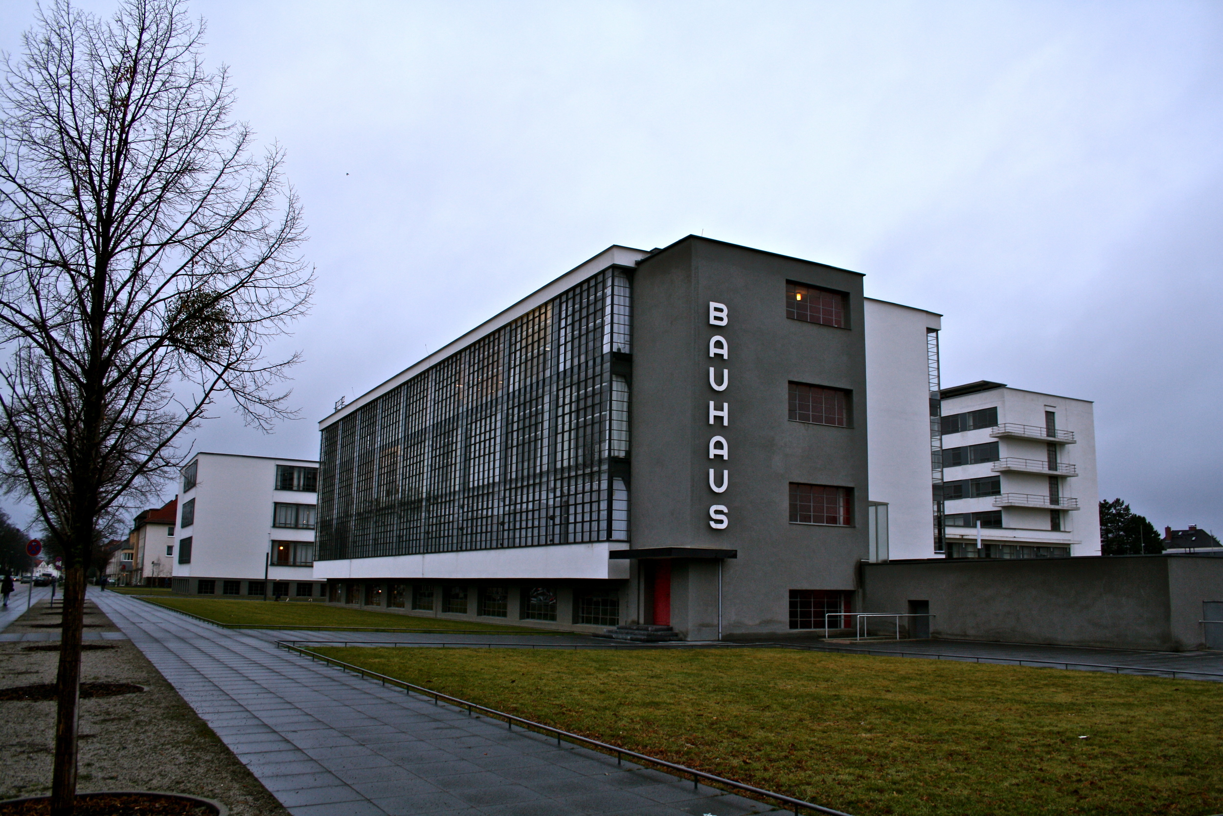
When I first enter the Bauhaus, the beginning of modern architecture, I find myself unimpressed. Sure, it has cool aspects, nice modern looking furniture and interesting lighting. Other then that it's pretty bland, but that's what the idea was about right? Only using what is necessary to complete the needs of the inhabitants. Sounds pretty sad for "modern architecture" but I suppose before Picasso could create his abstract art he had to start with the bare beginnings. So Gropius was right in stripping down architecture to what was necessary, giving us the options now to build off the simple and bring the post modern era into a new more complicated form of expression.
